Art Test
Blade Runner
This is an UI art test for a new fictitious game based on the 1982 film Blade Runner. Your character is a Blade Runner portrayed in first person and your mission is to hunt down and retire replicants. The test requires to output a Main Menu screen and a HUD screen within a limited time following these specifications:
Main Menu
- Screen size: 1920x1080px, place all elements within a safe area of 90% of the screen size.
- Search online for art assets, such as key art images.
- Create your own menu elements, such as icons.
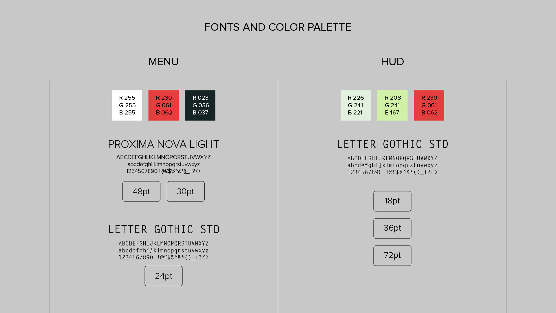
- Define the menu color palette, select not more than four colors.
- Use maximum two different font families and do not have more than three font sizes in the menu.
- Create an interesting background to accompany the menu but remember the menu carries the main focus.
- The menu must contain four main menu choices, each with submenu choices:
- Campaign (Resume Campaign, Load Saved Campaign, Start New Campaign).
- Multiplayer (Quick Match, Server Browser, Leaderboards).
- Options (Controls, Gameplay, Audio, Video).
- Extra (Help, Credits, Unlocked Art).
HUD
- Screen size: 1920x1080px, place all elements within a safe area of 90% of the screen size.
- Background: In order to properly test out the readability of the HUD, the background has to contain a movie sample, animation or other moving content. The length of the clip must be longer than ten seconds and the clip has to loop.
- The following HUD elements must be present:
- Weapon type and ammunition.
- Health.
- Minimap: Player, enemy and objective icons.
- 3D text tags; nametags over other characters and/or text tags over items to pick up or objectives.
- Information texts; e.g. mission brief/status.
Output

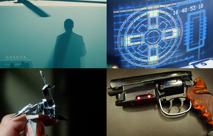
Fig. 1 Moodboard.
I decided to focus on some of the iconic elements from the movie such as the film-noir lighting and colour palette; the LCD retro-future UI design; the origami unicorn; and the industrial design. Although I feel that there some interesting ideas presented here I do feel that I could continue working on this material. At this stage, and in a work environment, I would take this proposal and present it to my work colleagues in order to discus further and brainstorm. I dedicated a total of 20 hours through three days of work.
Day 1: 4 hours for research.
Day 2: 8 hours for development.
Day 3: 8 hours for development and presentation.
Fig. 2 Video Mock.

Fig. 3 For the Main Menu I decided to maintain elements related to the user account at the top right corner. I think that the origami figure is a simple yet significant conceptual element that can tight together the top level UI.

Fig. 4 I would propose modular buttons for the sub-menu level which can be used with an icon or an image.

Fig. 5 Main Menu wireframe.

Fig. 6 For the HUD I decided to keep it as clean as possible without loosing the sci-fi flavour of it. I think that the enhance effect from the movie could be used here as a scanning element. Being a retro-futuristic movie I feel that there is a certain nostalgia towards the lowtech-CRT aspect of it.

Fig. 7 HUD wireframe.

Fig. 8 Complementary to the mood-board I created an updated version of the Blade Runner logo to help me shape the visuals. The iconography for the top level menus should follow this design language.

Fig. 9 Fonts and colours.

