This is a UI Art test for a job application I did in 2016. The requirement was to create the Main Menu and a HUD Screen for a Blade Runner game based on the original IP from the 80s. I had a week to create this Art Test and I was asked to spend no more than 20h working on it.

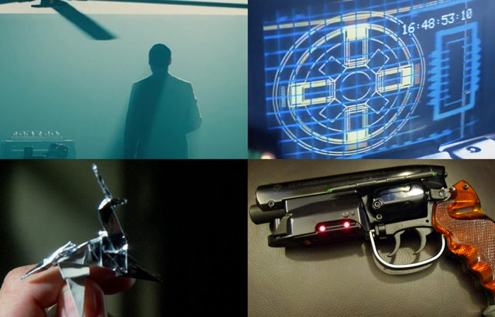
Moodboard.
I decided to focus on some of the iconic elements from the movie such as the film-noir lighting and colour palette; the LCD retro-future UI design; the origami unicorn; and the industrial design. Although I feel that there some interesting ideas presented here I do feel that I could continue working on this material. At this stage, and in a work environment, I would take this proposal and present it to my work colleagues in order to discus further and brainstorm. I dedicated a total of 20 hours through three days of work.
Day 1: 4 hours for research.
Day 2: 8 hours for development.
Day 3: 8 hours for development and presentation.
Video Mock.

Main Menu
For the Main Menu I decided to maintain elements related to the user account at the top right corner. I think that the origami figure is a simple yet significant conceptual element that can tight together the top level UI.

Multiplayer
I would propose modular buttons for the sub-menu level which can be used with an icon or an image.

Main Menu wireframe.

HUD.
For the HUD I decided to keep it as clean as possible without loosing the sci-fi flavour of it. I think that the enhance effect from the movie could be used here as a scanning element. Being a retro-futuristic movie I feel that there is a certain nostalgia towards the lowtech-CRT aspect of it.

HUD wireframe.

Logo.
Complementary to the mood-board I created an updated version of the Blade Runner logo to help me shape the visuals. The iconography for the top level menus should follow this design language.

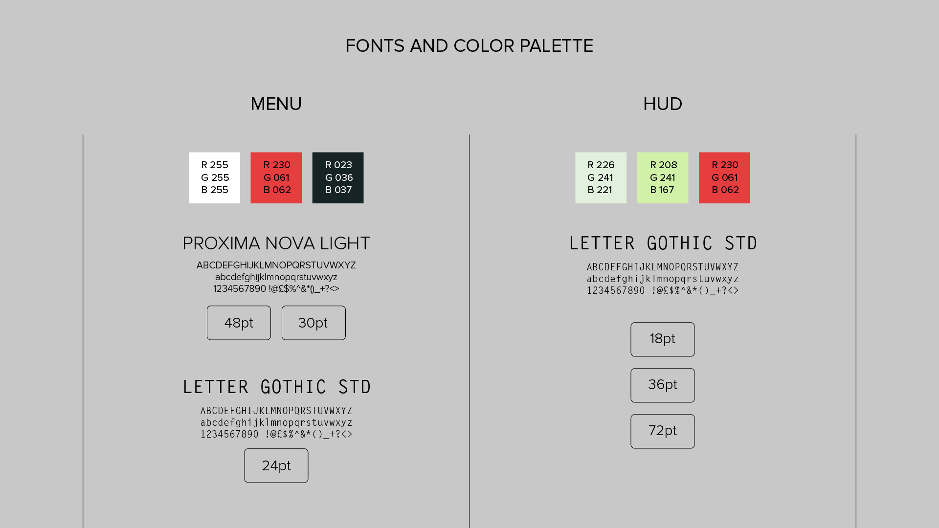
Fonts and color palette.

