
Need for Speed
2015
Publisher: Electronic Arts. Developer: GHOST EA.
Platform: PC, PS4, XBOX ONE.
My Contribution: UI Artist.
As UI Artist I was working closely with the UI Art Director and the entire team to create an intuitive navigation wireframe. I contributed since early stages of the project visualising how the menu system will work and distributing the HUD area in a balanced way. One of my big contributions was the creation of a photorealistic aerial 16k map of Ventura Bay.
Need for Speed is going back to its Underground origins. This is the reboot of Need for Speed with an open world that feels as authentic as never before. You can choose between five different paths to progress your game the way you want.

HUD.
The HUD is the resulting work of many talented artists and programmers. I worked mainly during the wire-frame stage balancing the composition and placement of elements as well as the navigation. Our goal was to keep the screen as clear and clean as possible and allow the player to enjoy the ride. I was not responsible for the final artwork in the game.
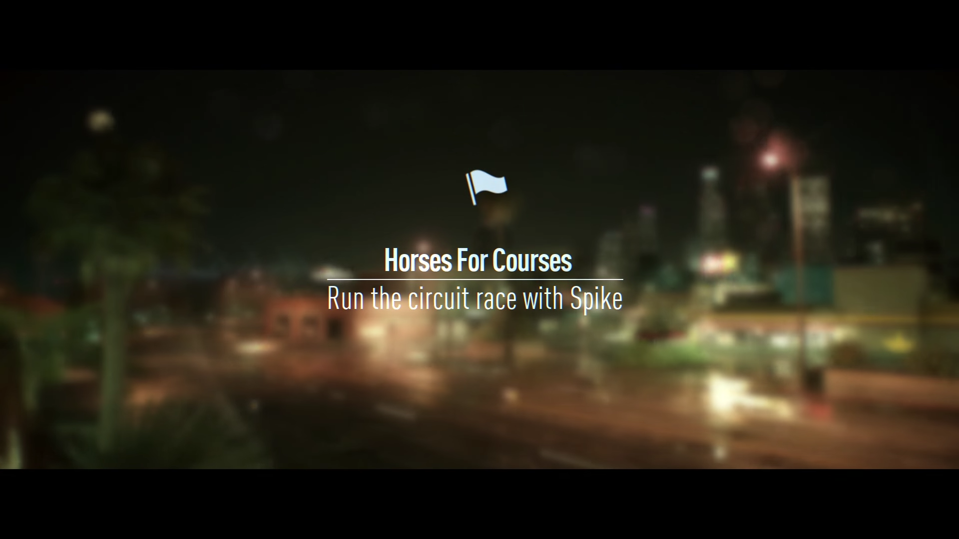
Event Cinematic Openings.
As Motion Graphics artist I also contributed with the Cinematics team by visualising sequences like Events Openings.

Ventura Bay.
Our technology allowed us to create a 16.000px by 16.000px high fidelity map which allows the player to zoom very closely in every area of the game. In order to create a hyperrealistic map I decided to use real satellite images to composite them on top of the white-box.

Ventura Bay, District 4.
I mainly used aerial images of Barcelona because it presented a great variety of locations.

Ventura Bay, District 4 detail.

Map Navigation.
As much as possible we wanted to keep the map clean of static menus; allowing the user to hide information takes advantage of the full screen.

Map Navigation.
Additional information is only displayed when the player chooses to highlight an item on the map.

Icons - Collectibles.

Icons - Events.

Front page sign-in concept wireframe.
For this idea I wanted to keep the sign-in process clean and simple.
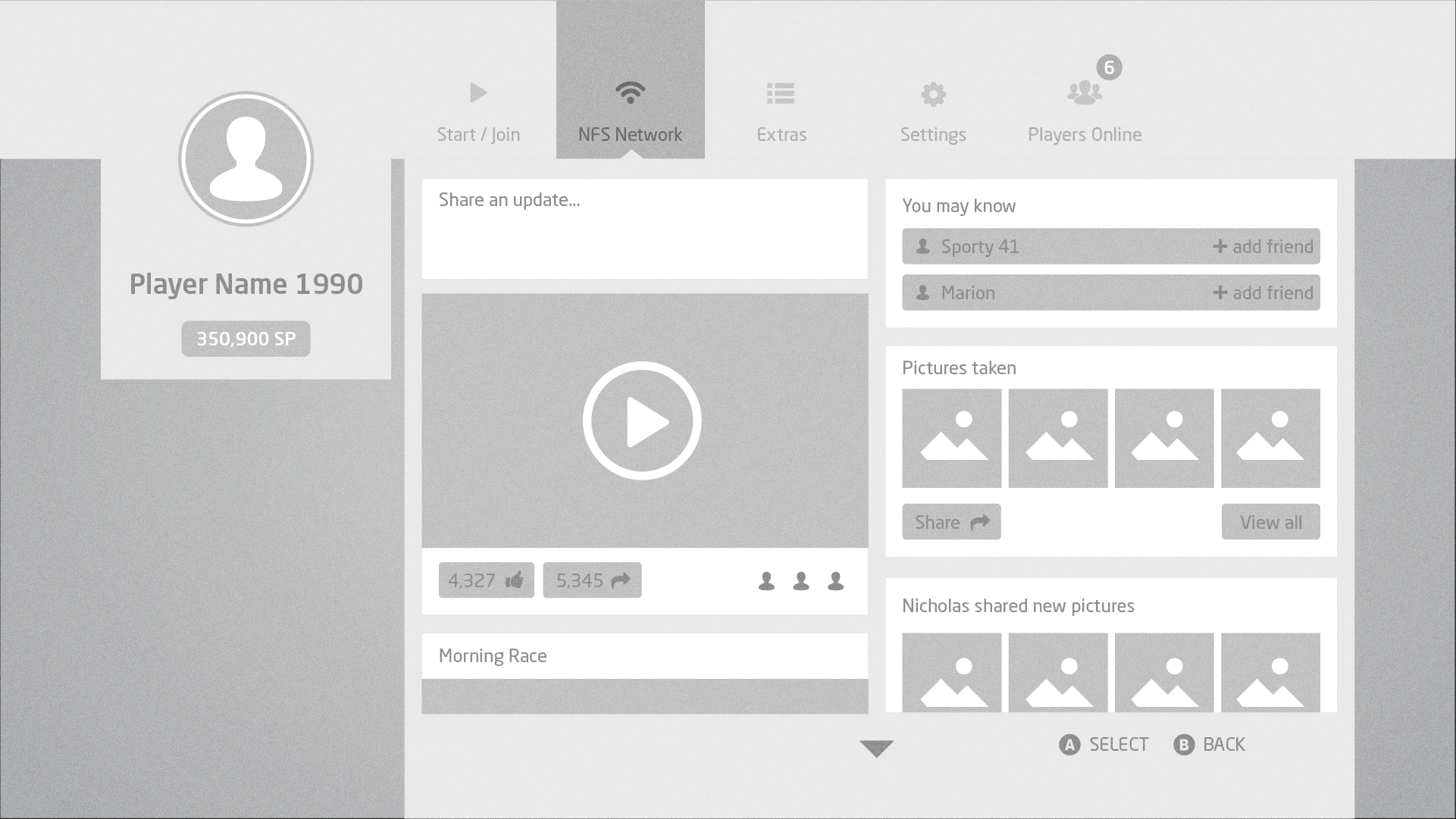
Social Media Menu concept wireframe.
One of the early explorations for this menu was to make it resemble a social media platform where players would share their videos, photos and achievements.

Front Menu concept wireframe.
The social media menu would have been integrated in the top menu level where other options and settings live.

Smartphone concept wireframe.
This is an early idea for all the apps that would live inside the HUD such as the map, messaging, and calls as well as provide customization options inside the garage.

Map navigation wireframe.
I created this guide to illustrate the limits for both the map texture and the cursor. It was important to leave space for the metadata to be displayed.
Video above: Map navigation mock wireframe.
Complementary to the previous image, this animation shows how map navigation would behave.
![]()
Early exploration for event icons.

Metadata collapsed.
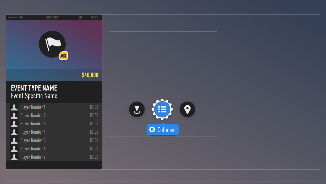
Metadata expanded.
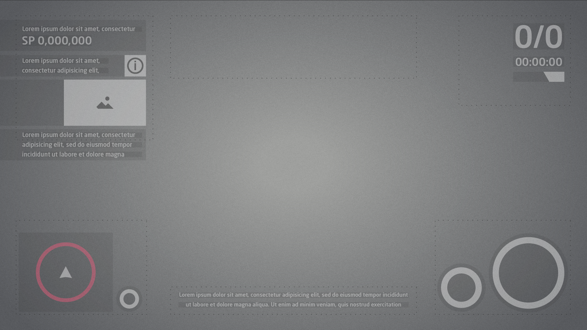
HUD wireframe.
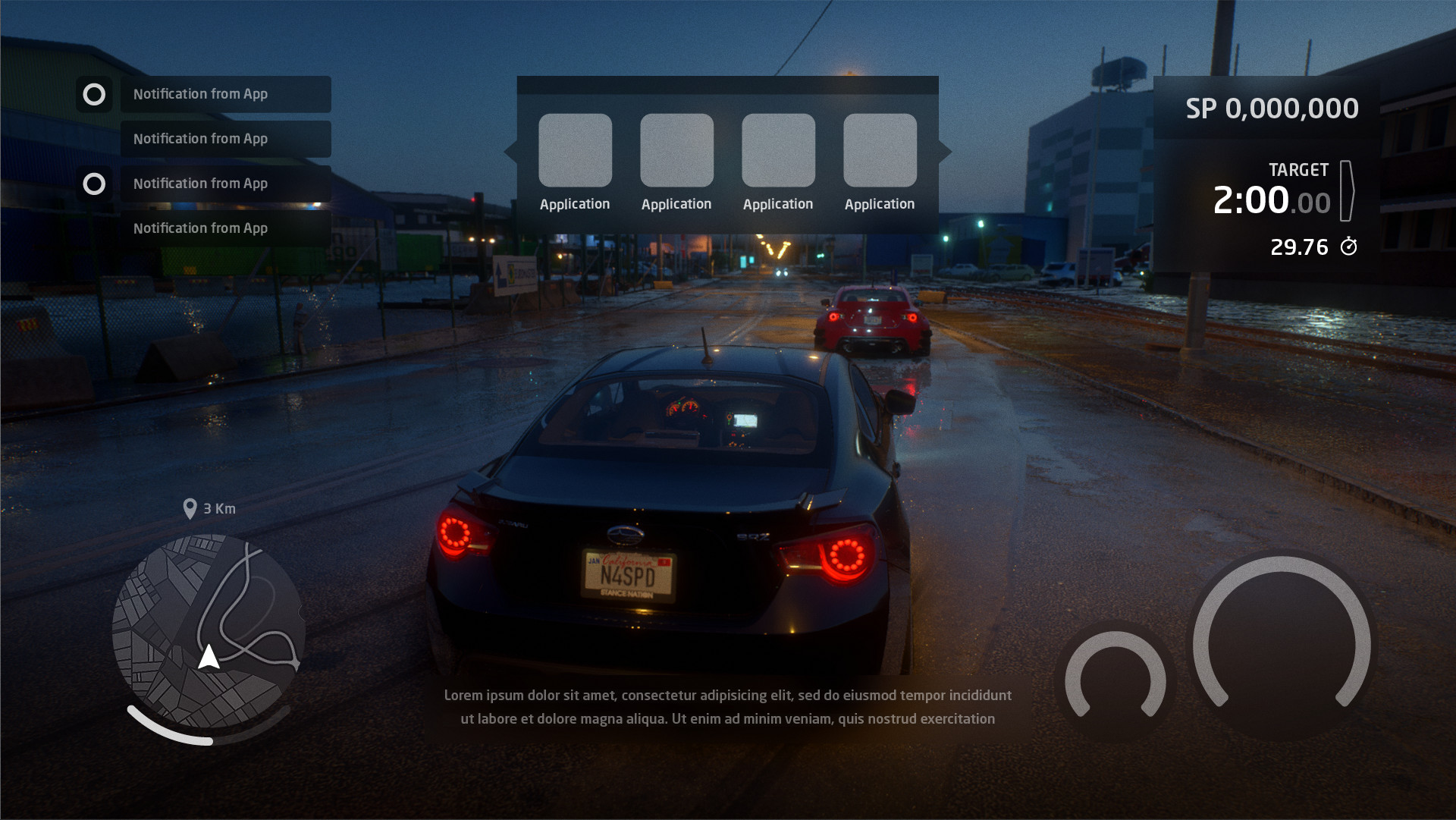
HUD wireframe mock.

Proposed Font.

NFS Rival's Font Analysis.
Font analysis. I started by doing an analysis of the font face that we used on Need for Speed Rivals and then propose an alternative font that would fit the style and Art Direction of the game.
All images property of Electronic Arts.

